Discover more about how Charles Booth plotted poverty in Victorian London with his ground-breaking poverty maps.
Words by John Rogers
It’s no secret that the post-Industrial Revolution years in Victorian Britain were a time of enormous prosperity and discovery for the upper classes. Britain was at the height of its imperial strength, governing over a fifth of the world’s population and boasting its most illustrious and impressive navy.
This prosperity was shared among a small number of wealthy hereditary landowners and a new class of industrial merchants and business owners, gaining wealth on the back of produce from overseas and off the back of cheap labour.
This wasn’t the case for everybody, though.
Although the Victorian era saw substantial progress throughout the second half of the 19th Century, London’s population exploded with people moving to the city from the countryside in search of work. Most of them ended up living in extreme poverty in slums.
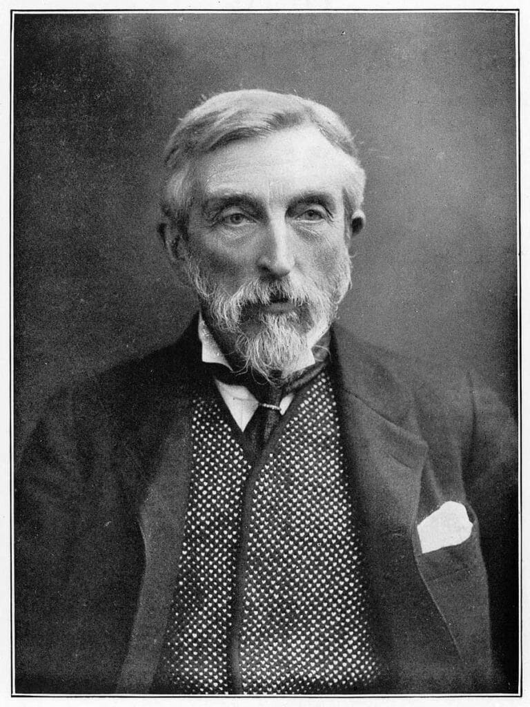
Enter Charles Booth, a man fascinated by the idea of poverty and determined to do something about it.
What Were the Charles Booth Poverty Maps?
So, before we can take a deep dive into the poverty maps themselves – let’s have a look at the man behind them…
Charles Booth was born in 1840 and became a wealthy and successful businessman in the leather and shipping industries.
As the socialist movement began to gain traction among the lower and working classes in the second half of the 19th Century, Booth moved to refute the claim that a quarter of London’s population lived in poverty.
He refused to believe that such a high proportion of the City of London, arguably the wealthiest city worldwide at the time, could contain such extreme poverty levels.
Something had to be done. So, undertaking an extensive survey lasting more than 15 years, Booth charted Londoners’ living and working conditions across the city.
The results were even worse than he thought, showing that a third of London’s inhabitants lived below the poverty line.
The History of the London Poverty Maps
Booth began his work in 1886 with a major survey of London life and work. After analysing census data, he was highly critical of existing poverty statistics and sat on a committee to determine improvements to the 1891 census.
Due to the scale of the survey, results were published in sections, with the complete seventeen volumes taking more than fifteen years to compile.
Undertaking the Survey
Booth’s work followed a claim of H.M. Hyndman, leader of Britain’s first socialist party, the Social Democratic Federation, who had stated in an 1885 article in the Pall Mall Gazette that “25% of Londoners lived in abject poverty”.
Booth couldn’t believe this figure but found his curiosity piqued and decided to investigate further.
Trying to round up the entirety of London in today’s age to take a survey doesn’t sound too simple, but back in Victorian times, this was a hellish affair.
He began with a pilot study in Tower Hamlets before hiring assistants, heavily drawn from Toynbee Hall, a university campus based in East London, to expand the survey across London.
The Methodology
The complex survey methodology was ground-breaking and innovative, containing unprecedented levels of in-person empirical research while collecting quantitative data on three sectors of people’s lives.
The first area looked at people’s occupations, their status at work, and working conditions.
The second focus was on people’s living conditions, which looked at their homes, how many people lived in the same room, and the urban environments they lived in.
The third facet collected data on the religious life of the city.
Booth and his investigators interviewed the London School Board visitors, who regularly inspected schools and collected data on children’s attendance. They also accompanied police officers on their beats to understand which areas were high in crime.
Interviews took place with factory owners, workers, and trade union representatives at work or in their homes.
His assistants collected religious data from priests, parsons, and ministers of religions and their constituent congregations across the city. Booth and his team kept notebooks of all interviews and data used to produce statistical evidence on Londoners’ living and working conditions.
Plotting and Publishing the Results
The survey results were published in four editions between 1889 and 1903, each entitled Life and Labour of the People. The first edition, in 1889, comprised two volumes, and the final one published in 1903 included 17 volumes.
Booth was careful with the information he published. Only information that contained quantifiable data was published in the public domain, meaning that nothing that would identify or embarrass individual interviewees was included.
Much of the vivid personal detail that provides the context for the survey and maps remain in Booth’s notebooks, held at the London School of Economics.
What Did the Maps Show?
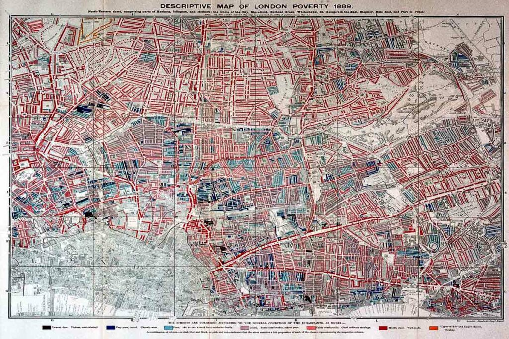
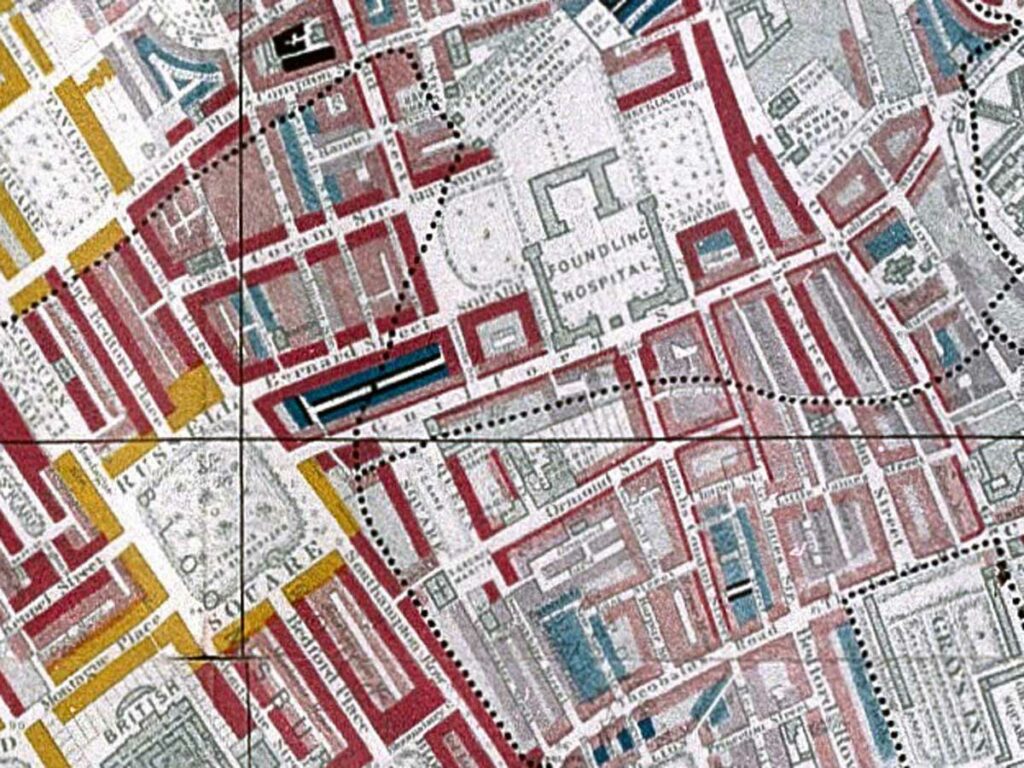
Rather than relying on a lengthy worded interpretation of results, Booth published colour-coded maps that identified the most deprived and prosperous parts of London on a street-by-street basis.
Ranging from black, which identified the “vicious, semi-criminal” streets through shades of blue identifying “very poor” and “poor” areas, through pink and red showing “fairly comfortable” and “well-to-do” areas to yellow, which showed the wealthiest parts of London.
The final twelve sheets, plotting the results of the 1903 survey, covers an area stretching from Hammersmith to Greenwich on the west-to-east axis and Hampstead to Clapham from north to south.
Why Were The Charles Booth Maps Important?
Well, the maps were a valuable source in pushing social change in the early 20th Century, influencing things like the introduction of Old Age Pensions and free school meals.
Booth was shocked to find that the actual proportion of Londoners living in degradation was around a third of all inhabitants, with the most significant number of those in poverty dwelling south of the Thames.
And, if you fancy having a nose around Booth’s work, including the maps, you’ll find it on a searchable online database on the London School of Economics website.